
How Colors Shape Mood and Tell Stories in Nature-Inspired (Biophilic) Home Design
Walk into a home where you feel a sense of calm and comfort, I’d be willing to bet you’re seeing some natural textures, shapes and colors. Every color hue either calms you down or lifts you up, especially if natural sunlight enhances the colors, softening the mood, or just making everything feel more alive. That’s the charm of “biophilic” nature-inspired design—pulling the outdoors inside. And the colors you’re seeing, or rather “feeling”, are the unsung heroes making it happen. Those tones don’t just make a room pop, they sync with our brains, tweak our moods and spin stories that connect us to our internal roots. But why do colors have this power? Let’s dive into some science and try to crack this code.
Why Colors Affect the Brain: Nature’s Playbook
Color affects us on both a biological and emotional level. It can change how we feel, focus and even behave. The process starts with our eyes; light pours in, sparking tiny cone cells in your retina that grab red, blue and green tones. Those signals transmit to your brain’s visual cortex, where areas like the fusiform gyrus turn them into emotions. This is the part of the brain and gives instant recognition to things like faces, shapes, numbers and words. In a nature-inspired home, this echoes how we’re connected with the earth, and reveals how our brains were wired for colors from the beginning.

Natural Attraction: Studies show that colors spark our minds in different ways. The NIH (National Institutes of Health) found warm tones (reds, yellows) stir up stronger brain reactions than cool ones (blues, greens), like sunshine versus a shady forest or cool stream. The Max Planck Institute noted that the color red boosts brain waves, sharpening focus and feelings. You know how it’s easier to spot a ripe berry in the brush? That’s why. And Forbes highlights some research showing that green reduces stress and fine tunes our attention. Think of how you feel after a walk in the woods. So, at the end of the day, science is at the root of nature’s call.
“…(Colors) are shortcuts to emotions we’ve felt in nature since way back.” –Dr. Sally Augustin
Soul Meets Body Meets Wild: Colors don’t stop at your head—they ripple through your body. Blue promotes relaxation as it slows down your limbic system, like sitting by a quiet river under a clear blue sky. On the other hand, Red revs up your heart rate and blood pressure. Just imagine that calm moment by the river interrupted by a bright red snake or spider creeping around nearby. Get the point? Finally, the color green tends to balance you out. Here’s a little nod to nature’s healing influence: hospitals use it for that. “Color isn’t just visual; it’s physical,” says Dr. Sally Augustin, an environmental psychologist who studies how spaces affect us. “Red can get your blood moving, while blue tells your body to relax.”
Nature’s Emotional Pull: Our brains tie colors to the wild we know. Green’s healing effect reflects grassy fields. Blue’s peace can evoke a sense of open skies or water. Yellow brings on a sunny boost to our day. “We’ve evolved with these colors,” Augustin adds. “They’re shortcuts to emotions we’ve felt in nature since way back.”
“Red is typically associated with danger, and this can lead to a heightened state of arousal in the body—even if you’re not consciously aware of it,” explains Dr. Elliot. — Elliot et al., Journal of Experimental Psychology: General, 2007
Studies That Support Nature-Inspired Design

Science and experts back this up– Let’s recap:
NIH’s Color Studies: The National Institute of Heath found that warm hues spark more brain action than cool tones—like sunlit soil versus a cool creek. It’s nature’s resounding undertone that plays as a common them inside us.
Reds Wake Us Up: Numerous studies show that red amps brain activity for alertness—perfect for a nature-inspired kitchen with clay-toned reds, like earth or fallen leaves.
Greens Reduce Stress Forbes cites studies where green slashes stress and boosts focus, a no-brainer for nature-inspired homes—think mossy walls or plant vibes. “Green’s a reset button,” says Leatrice Eiseman, head of the Pantone Color Institute and a color guru. “It’s why we feel refreshed in forests—and why it works so well indoors.”
Blues Create Calm: Research says blue drops heart rate and tension, like staring at a lake. In a nature-inspired space, it’s the hue of sky through a window or a watery nook.
These aren’t just theories—they’re how we’ve clicked with nature’s colors forever, backed by pros who’ve seen it play out.
Coloring a Nature-Inspired Home

In a nature-inspired home, colors come from sky, earth and plants to set the mood:
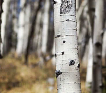
Warm Tones (Red, Orange, Yellow): These bring sun and soil inside. A rusty red wall or golden pillow can wake up a living space, like a meadow at dawn. They’re cozy and grounded, but too much red might feel like a wildfire. try it in wood tones or pots.
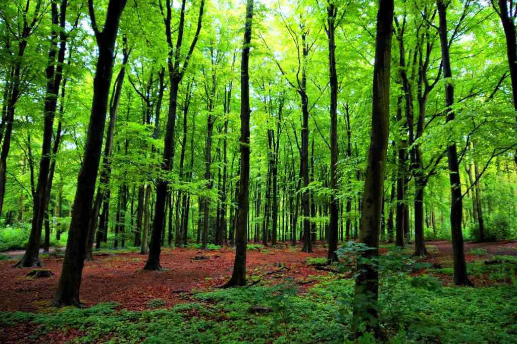
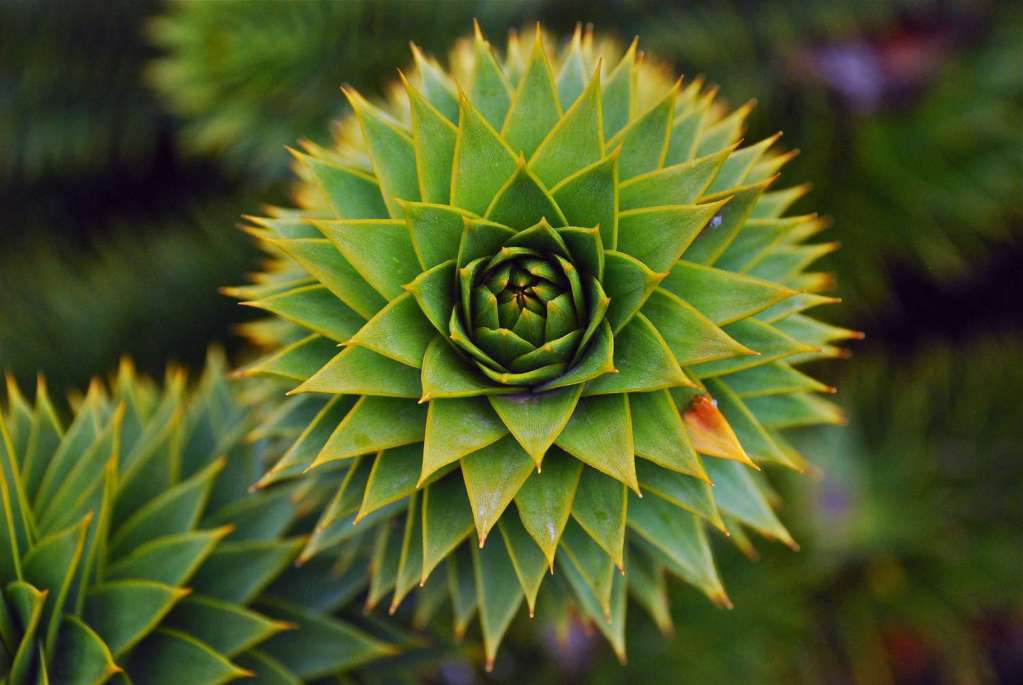
Cool Tones (Blue, Green, Purple): Nature’s chill squad. Green walls or chairs echo forests, easing stress, which is great for a bedroom hideaway. Blue, think sky or water, can soothe your aching soul, like in a bath or comfy reading nook. Purple, like wildflowers, adds a creative pop to a crafted corner of a room.
Neutral Tones (White, Black, Gray): These tones are nature’s bones—stone, bark, clouds. White opens a room like a bright sky, but warm it with wood so it’s not stark. Black’s a deep shadow, perfect to accent a chair or frame a picture. Gray’s steady like rocks, keeping it all solid and well-grounded.
Color, Place, and Meaning in Nature
Colors carry stories from the land we’ve lived on. Green’s peaceful influence is universal, but yellow’s cheer in a sunny field might feel heavy where it’s tied to harvest time and coming winter. Red’s warmth could be a desert glow or a warning berry. “Context matters,” says Eiseman. “A color’s story shifts with the culture and landscape it’s in.” In a nature-inspired home, you’re picking hues that sing to the tune of your turf, making your space a personal piece of the outdoors.
Making It Home: Nature-Inspired Color in Action
Imagine this: soft green walls in your living room that help you relax after a tough day without even thinking about it. Warm amber tiles in the kitchen, kind of like sunbaked earth, that make the space feel lively and inviting, inspire conversation and connection. And pale blue in the bedroom, like the sky just before night, helping you wind down. Your imagination and the sky itself are the only limits when bringing the outdoors in. Your guide is to think: “How is this element that I’m considering adding to my space connected to that one in nature?” After that, it’s “game on!”
So, you get it. The colors you pull from nature have a quiet way of shifting how a space feels. Coffee shops go for earthy browns, spas love soft blues; but at home, it’s all up to you. Want calm? Go green. Need a little energy? Try some amber. Again, I know this may sound a little floaty, but it’s backed by real science and it really works!
A Colorful Wrap-Up

Color isn’t just something we see—it’s something we feel. The moment light enters our eyes, it sets off a chain reaction. Our brains interpret it, our bodies respond, and our moods shift—often without us even realizing. These responses aren’t random. They’re the result of brain wiring cultivated by thousands of years of living alongside natural landscapes, where color signaled everything from danger to safety, and nourishment to rest.
In nature, color has always carried meaning. The deep green of a forest, the soft blue of a clear sky, the fiery red of a sunrise—these hues shaped our sense of calm, alertness, and well-being long before we ever picked up a paintbrush or chose a sofa. That innate wiring is still with us today, which is why the colors we choose for our homes matter more than we might think.
Research backs this up. Studies have shown that red can increase heart rate and energize us—just like the early morning light that stirs animals and humans alike. Green has been linked to lower stress levels and faster recovery times in healthcare settings, echoing the soothing presence of plants and trees. Blue promotes relaxation and focus, reminiscent of calm water or a cloudless sky. These effects are subtle, but powerful. They help explain why certain rooms feel energizing and others feel like a refuge—and why thoughtful color choices are a cornerstone of biophilic design.
So when you’re picking paint for your walls, choosing throw pillows, or shopping for a rug, you’re not just making a style decision. You’re shaping an experience. You’re tuning your space to reflect the rhythms of the natural world—inviting in calm, sparking creativity, or setting the stage for deeper rest. A nature-inspired home doesn’t just look grounded—it feels grounded, because every element, including color, is working in harmony with how we’re built.
And that’s the magic of it. Color tells a story. Not just about the room, but about you—how you live, how you want to feel, and how you connect to the world outside your windows.
Discover more from NaturAbode
Subscribe to get the latest posts sent to your email.